
Hostinger checkout redesign: Identifying usability issues and designing improvements
Personal project for learning and portfolio
While exploring Hostinger’s website, I noticed that their checkout process felt a bit too complex - something that could make users hesitate before completing their purchase.
I saw an opportunity to simplify the experience and make it feel smoother and more intuitive. The goal wasn’t just to make it look cleaner, but to improve how it works - guiding users more confidently toward completion, reducing drop-offs, and ultimately helping the business convert more visitors into active users.
I’ve noticed 4 things that could be improved.
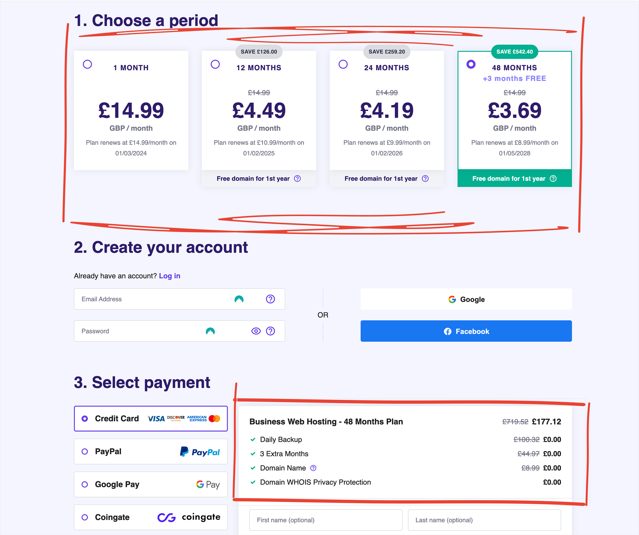
The first thing I noticed is that it’s unclear what features customers get when they buy a web hosting plan. The confusion arises from differences between the features listed on the landing page and those presented on the checkout page.
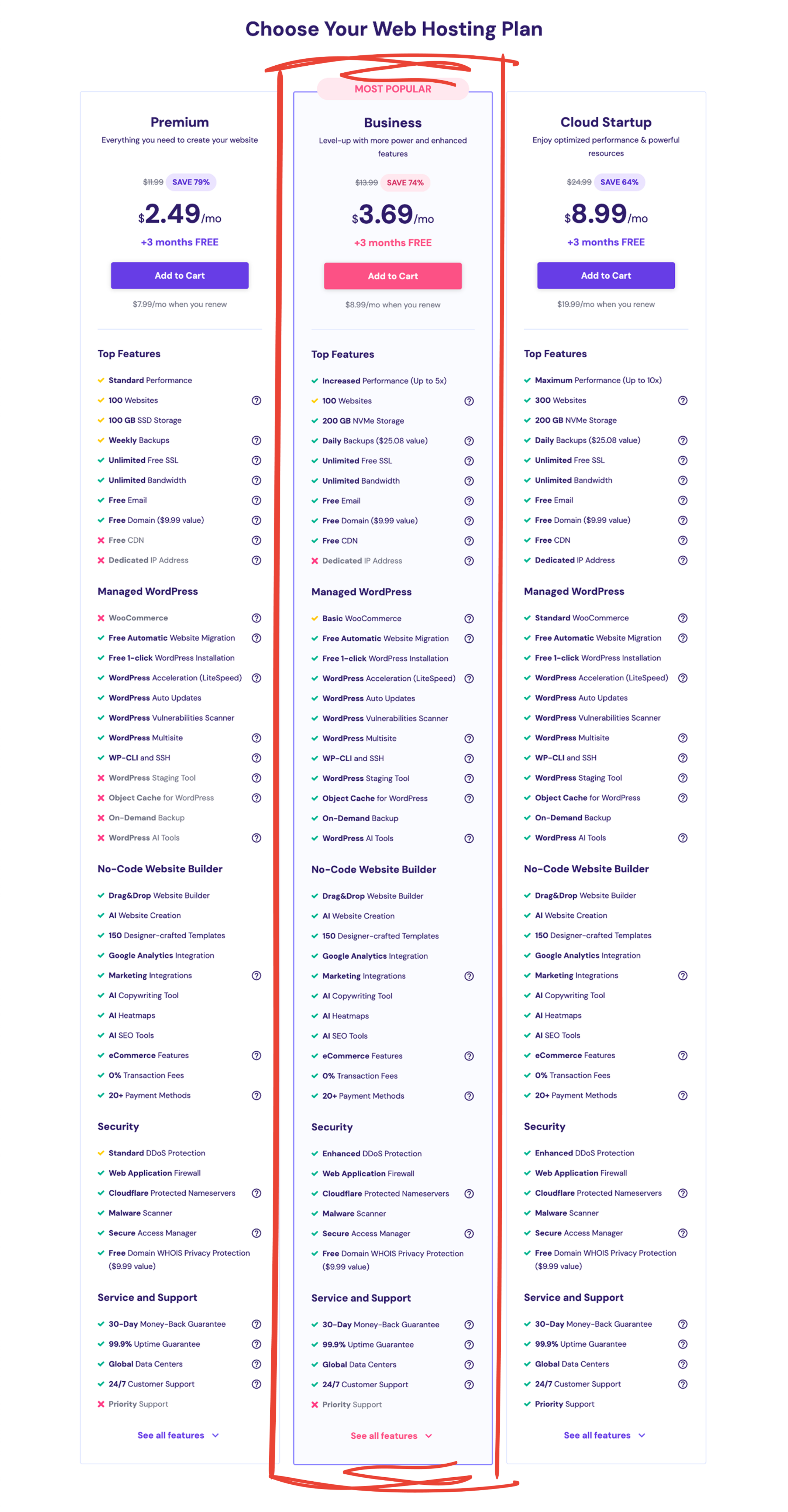
(Landing page screenshot - sorry, the image quality didn’t survive the export)
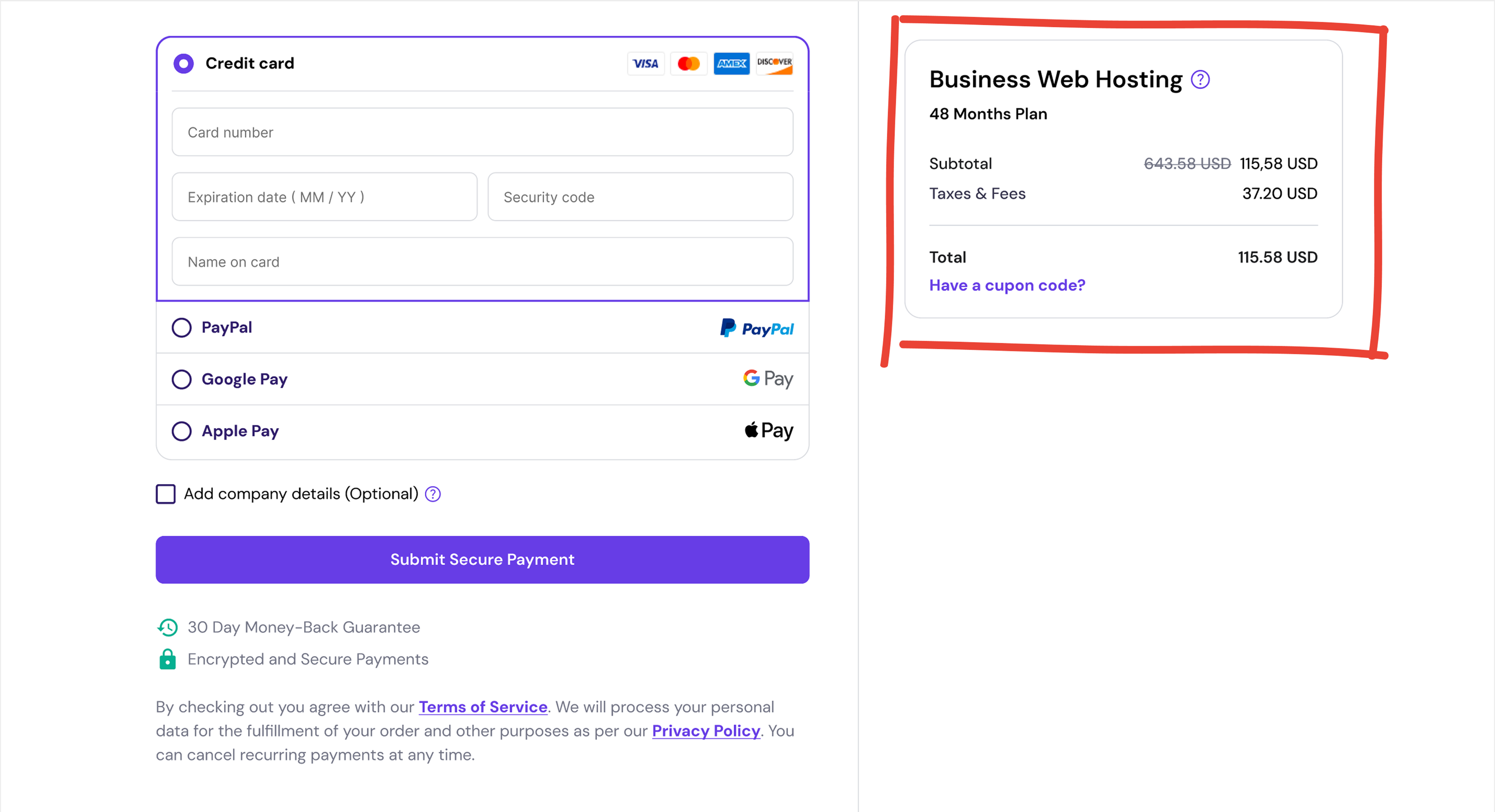
In the checkout, only a few of the features are listed, and there is no option to check the full list. Doesn't this seem a bit confusing? I believe this difference can raise questions for some people.
(Checkout page screenshot)
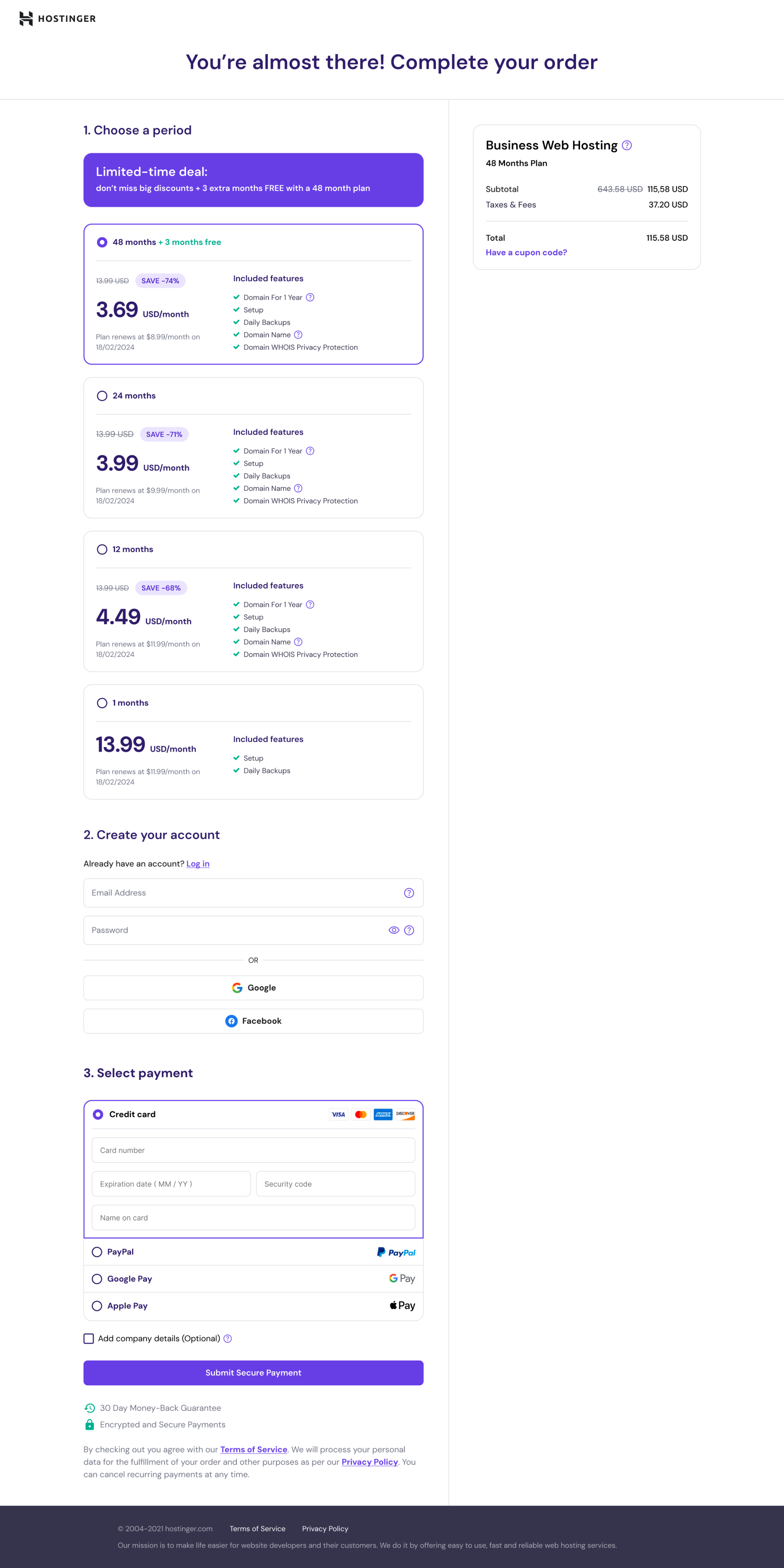
Solution: I redesigned the entire checkout page and divided it into two clear sections.
- On the left side, users can select a plan, create an account or log in, choose a payment method, and complete the purchase.
- On the right side, an order summary card displays the selected plan and the total price.
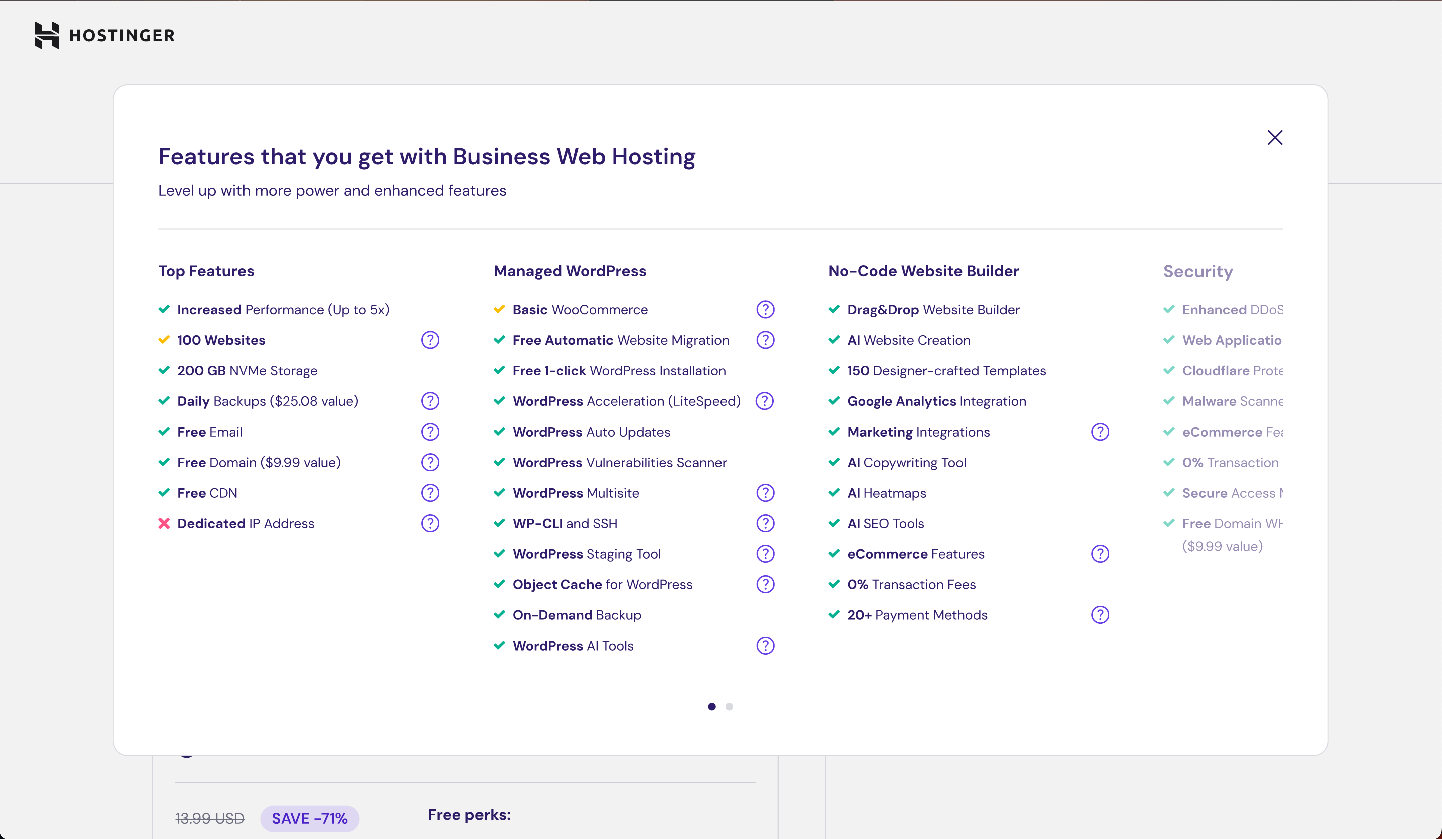
Next to the plan name, I added a “?” icon – a small information icon that’s used across the website. When clicked, it opens a popup explaining all the details of the selected plan.
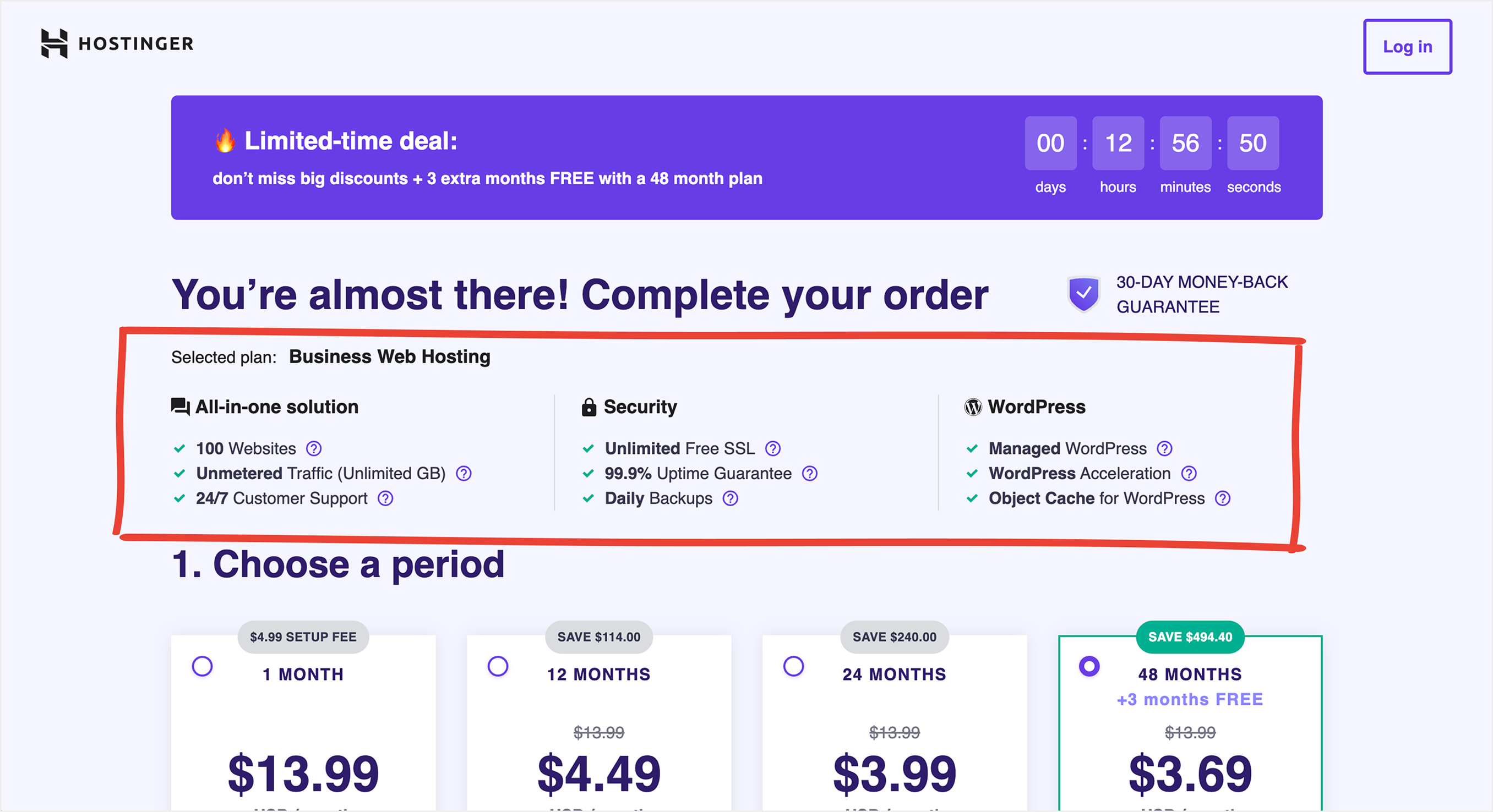
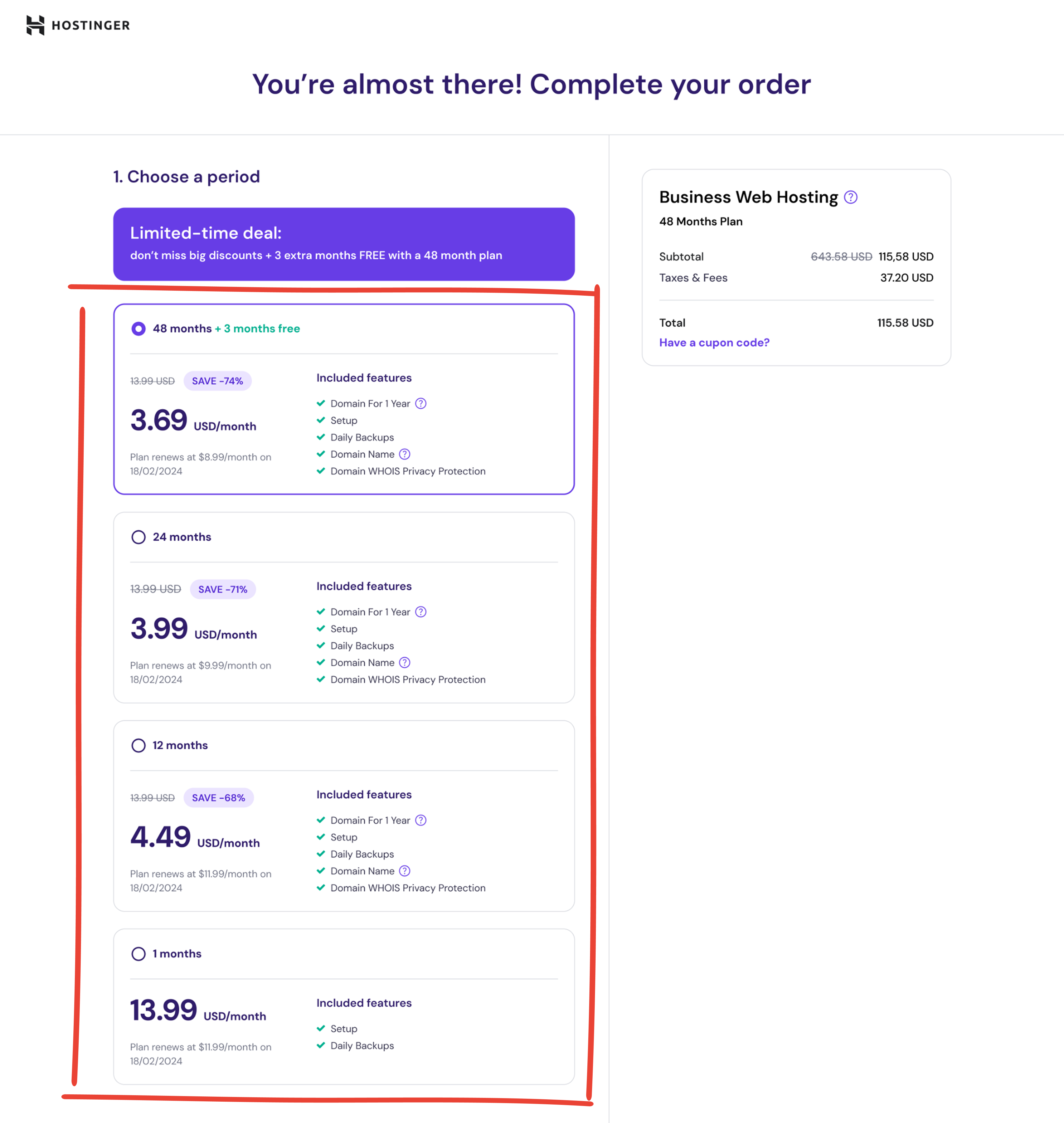
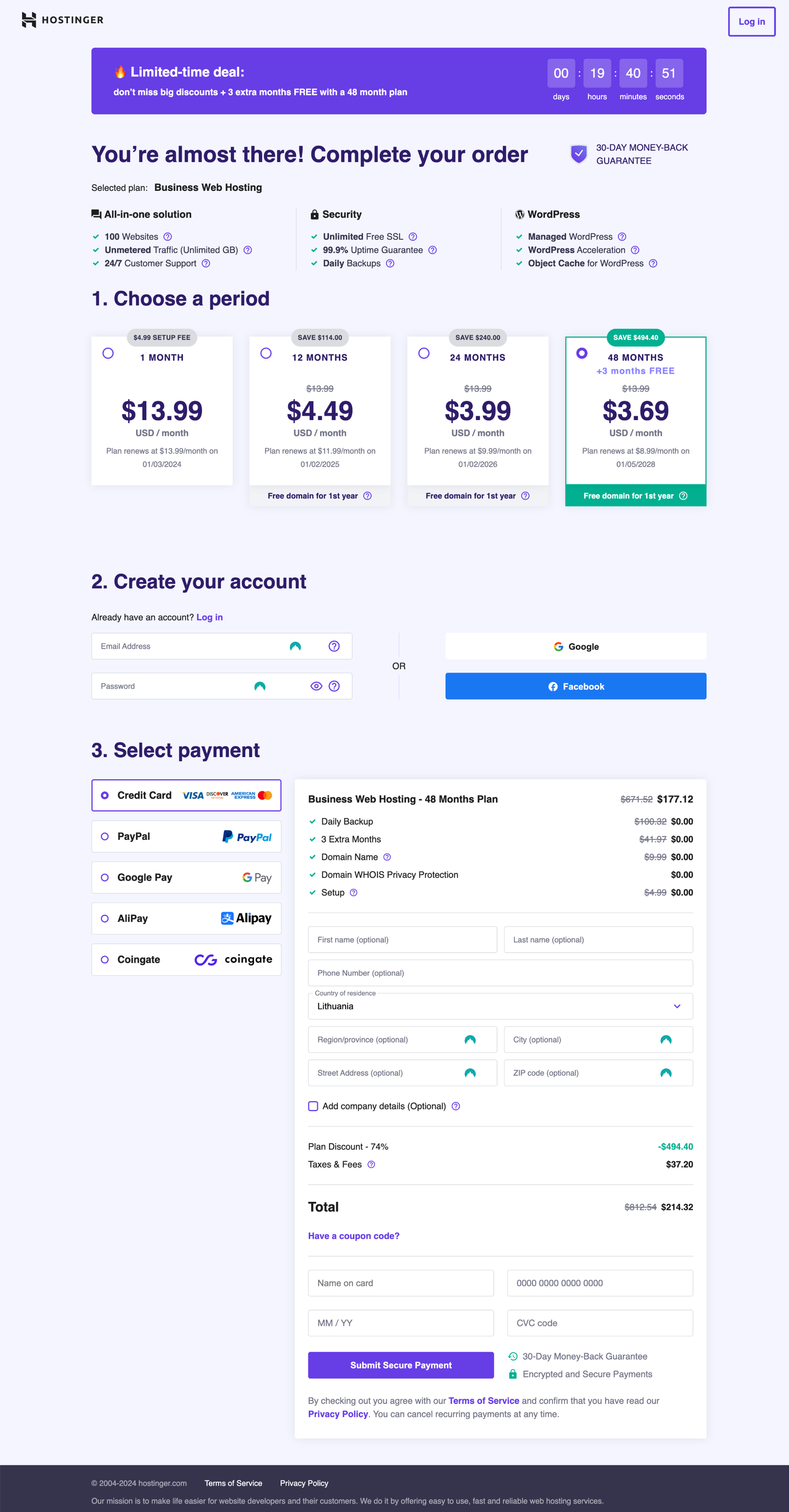
The second thing I noticed is that the period section suffers from transparency issue, particularly in the visibility of free features when selecting a hosting period. Customers are required to scroll down to access information about the complimentary features associated with their chosen hosting duration.
Solution: I redesigned the period selection cards to make them more informative. Each card now clearly displays all relevant details, including the complimentary features associated with that specific plan.
Hey, timeout alert! Even books deserve a breather. If you’re still with me, let’s fix two more things!

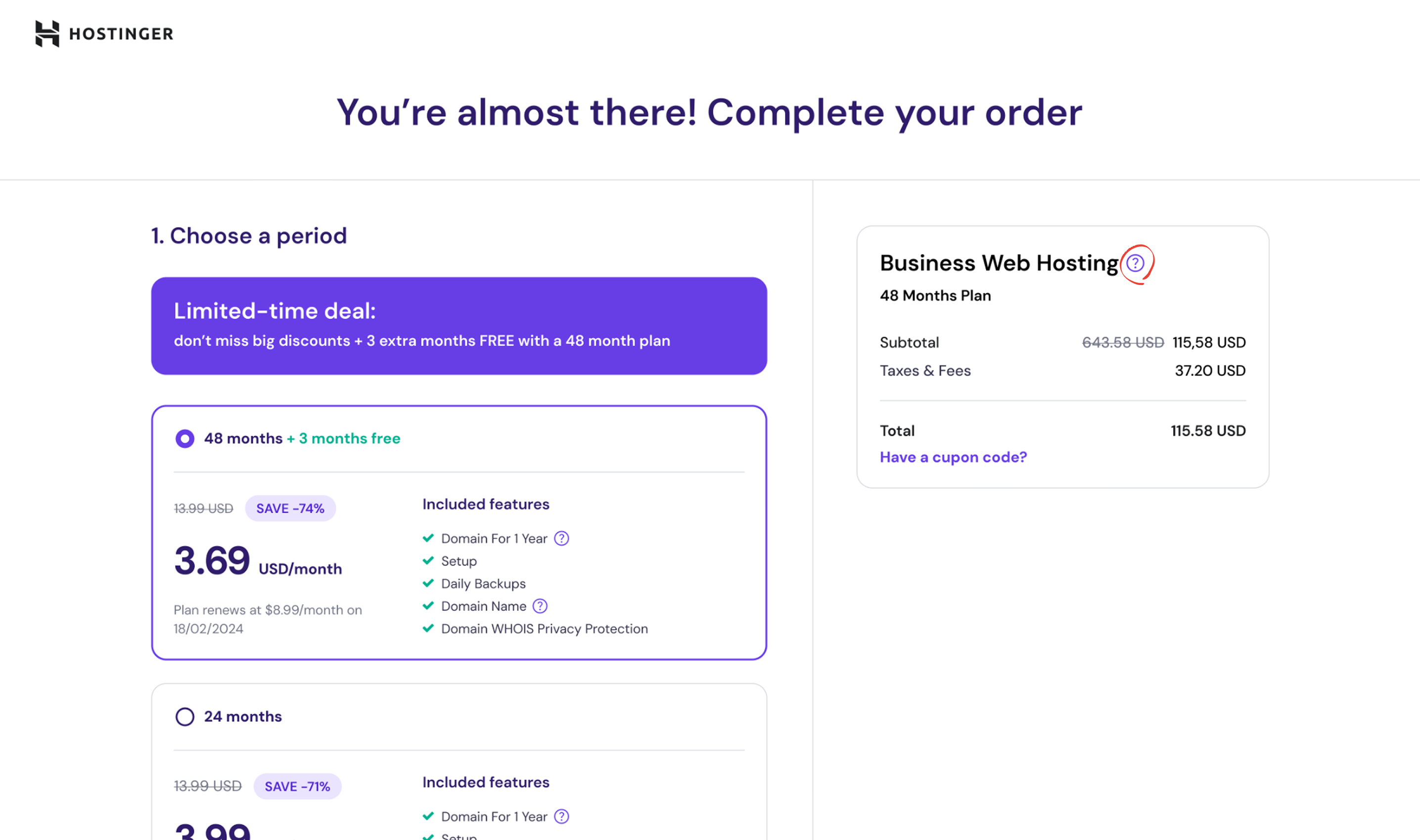
The third thing I noticed is that when people try to submit a payment, the selected plan isn’t visible. To double-check their choice, they have to scroll back up.
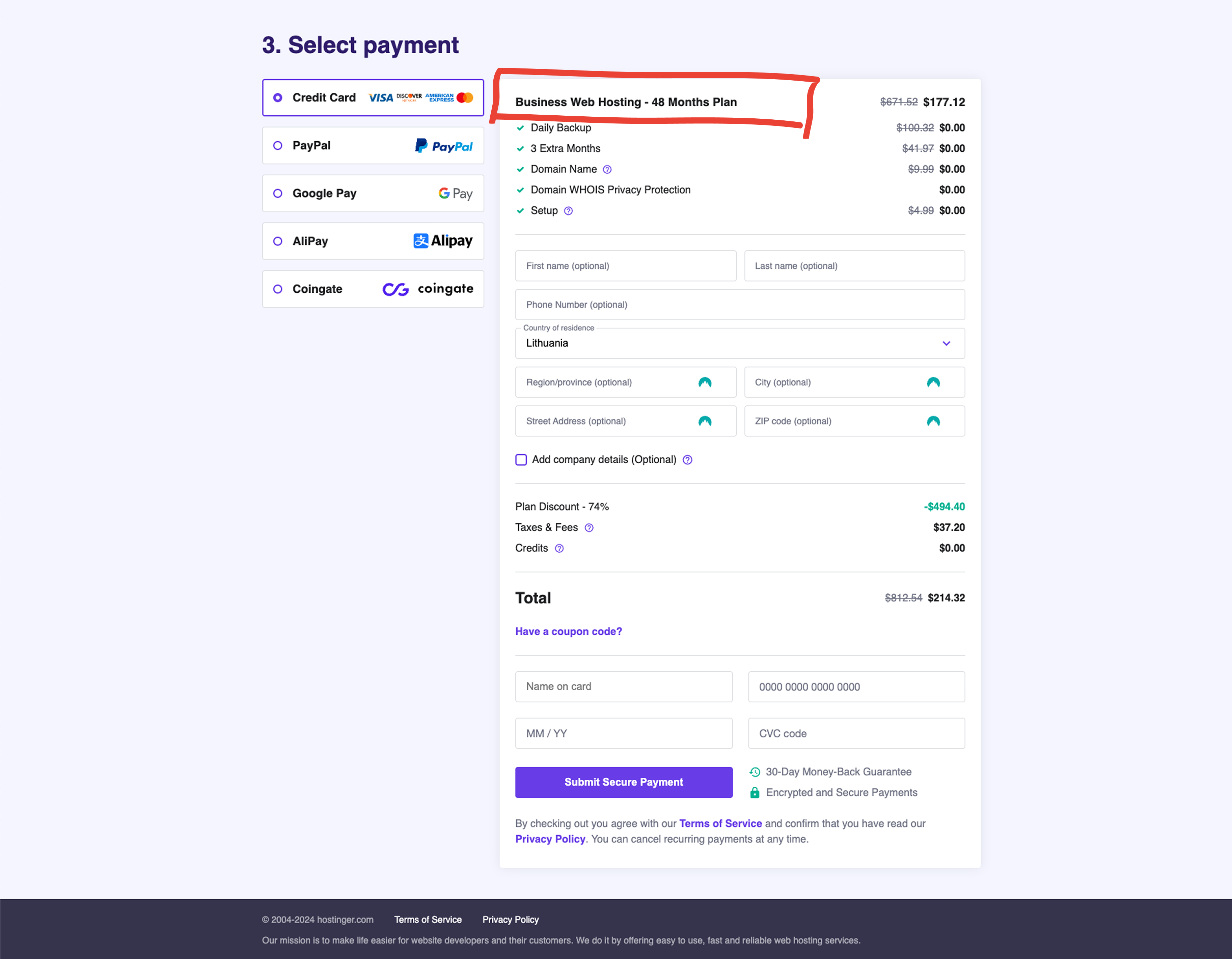
The fourth thing I noticed is that price information is scattered across different sections of the interface. Users see the plan price in one place, while discounts, taxes, fees, and the total amount are shown elsewhere - which makes it harder to understand the final cost.
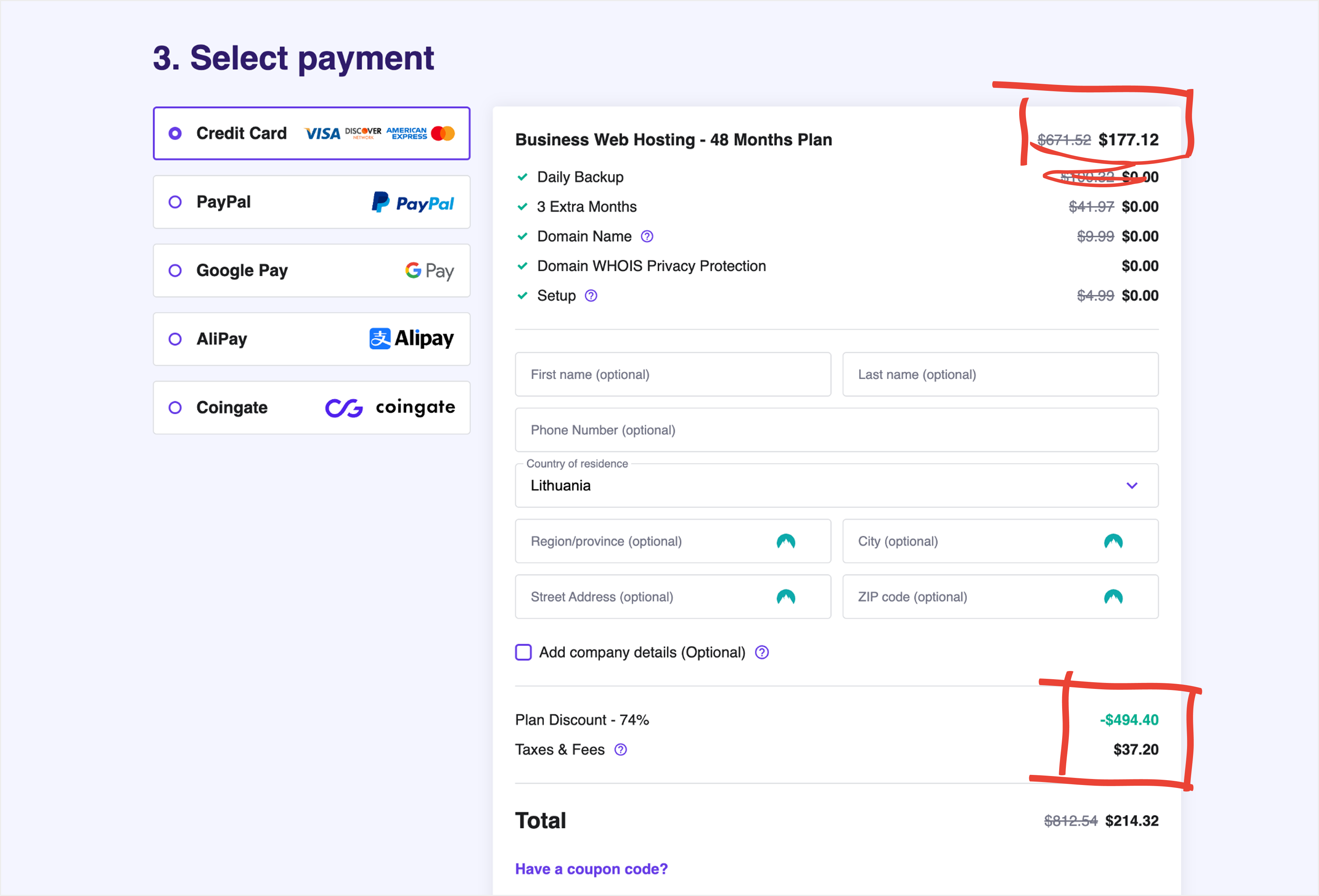
Solution: A sticky card positioned on the right side gracefully moves to the bottom as you scroll down. The card displays the selected plan along with key details such as duration, subtotal, taxes, and the total amount.
Current checkout page
Redesign
Martynas Guliokas
Reach out
Hostinger checkout redesign: Identifying usability issues and designing improvements
Personal project for learning and portfolio
While exploring Hostinger’s website, I noticed that their checkout process felt a bit too complex - something that could make users hesitate before completing their purchase.
I saw an opportunity to simplify the experience and make it feel smoother and more intuitive. The goal wasn’t just to make it look cleaner, but to improve how it works - guiding users more confidently toward completion, reducing drop-offs, and ultimately helping the business convert more visitors into active users.
I’ve noticed 4 things that could be improved.
- The first thing I noticed is that it’s unclear what features customers get when they buy a web hosting plan. The confusion arises from differences between the features listed on the landing page and those presented on the checkout page.
(Landing page screenshot - sorry, the image quality didn’t survive the export)
In the checkout, only a few of the features are listed, and there is no option to check the full list. Doesn't this seem a bit confusing? I believe this difference can raise questions for some people.
(Checkout page screenshot)
Solution: I redesigned the entire checkout page and divided it into two clear sections.
- On the left side, users can select a plan, create an account or log in, choose a payment method, and complete the purchase.
- On the right side, an order summary card displays the selected plan and the total price.
Next to the plan name, I added a “?” icon – a small information icon that’s used across the website. When clicked, it opens a popup explaining all the details of the selected plan.
- The second thing I noticed is that the Period section suffers from transparency issue, particularly in the visibility of free features when selecting a hosting period. Customers are required to scroll down to access information about the complimentary features associated with their chosen hosting duration.
Solution: I redesigned the period selection cards to make them more informative. Each card now clearly displays all relevant details, including the complimentary features associated with that specific plan.
Hey, timeout alert! Even books deserve a breather. If you’re still with me, let’s fix two more things!
- The third thing I noticed is that when people try to submit a payment, the selected plan isn’t visible. To double-check their choice, they have to scroll back up.
- The fourth thing I noticed is that price information is scattered across different sections of the interface. Users see the plan price in one place, while discounts, taxes, fees, and the total amount are shown elsewhere - which makes it harder to understand the final cost.
Solution: A sticky card positioned on the right side gracefully moves to the bottom as you scroll down. The card displays the selected plan along with key details such as duration, subtotal, taxes, and the total amount.
Current checkout page
Redesign
Martynas Guliokas
Reach out