
Žiogas app redesign: Identifying usability issues and designing improvements
Personal project for learning and portfolio
While exploring the Žiogas public transport app, I noticed that the experience felt a bit confusing - especially for people new to the system.
I saw an opportunity to create a smoother, faster flow that makes it easy for anyone to buy a ticket without overthinking. This redesign focuses on reducing friction and making public transport feel effortless and intuitive.
I’ve noticed 4 things that could be improved.
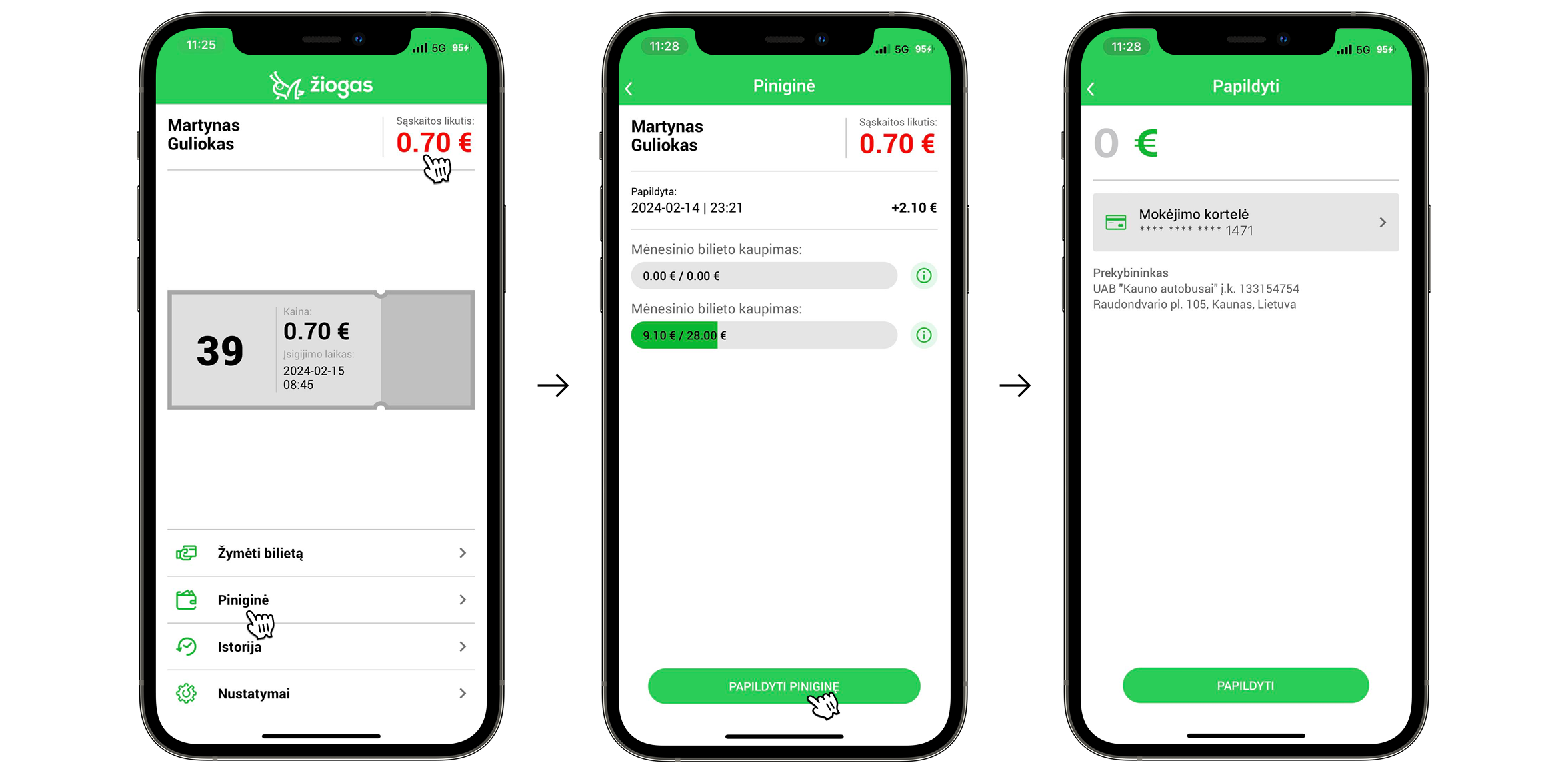
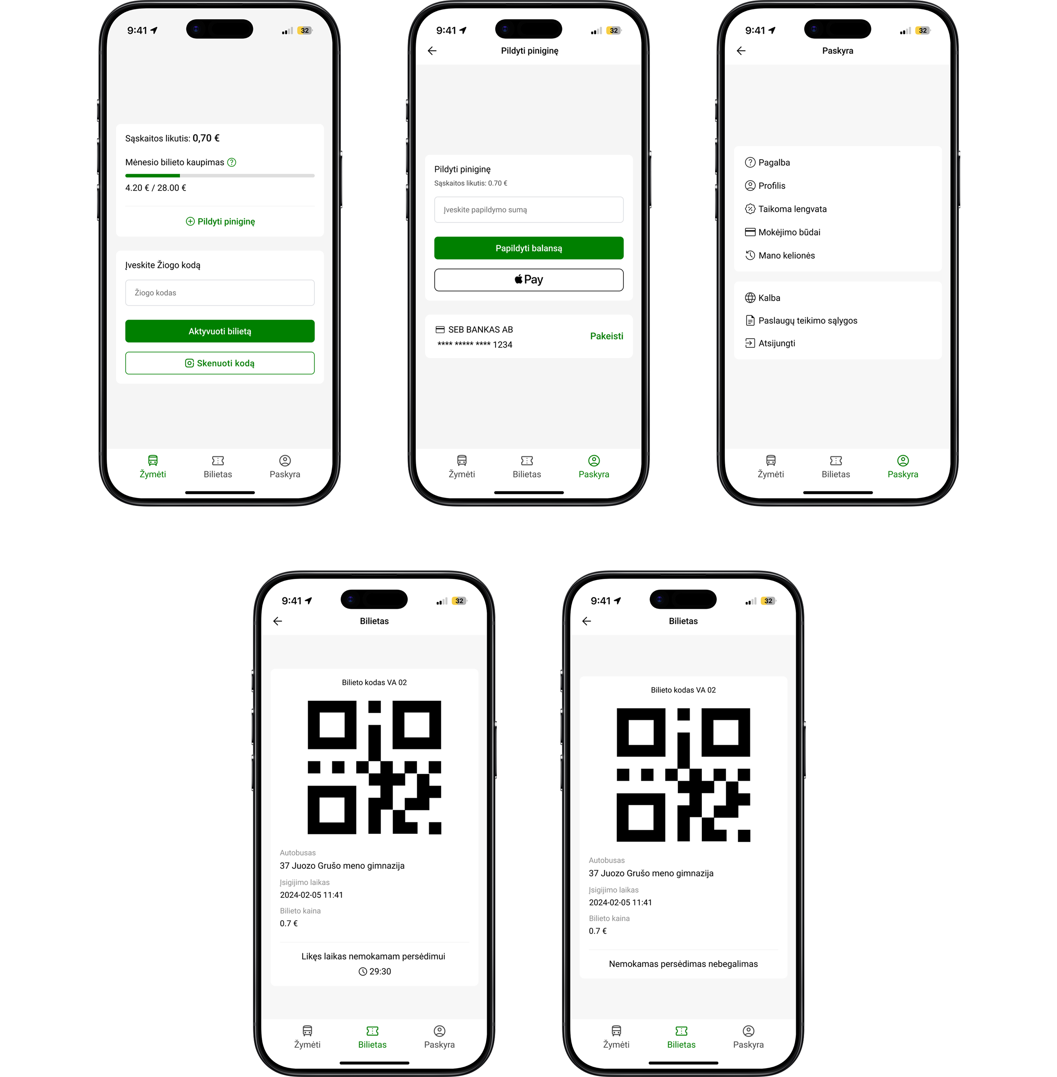
The first thing I noticed is that there are two ways to top up your wallet, and both could be improved.
- The first option - tapping the red balance amount - is unclear because there’s no visual indicator or affordance suggesting it’s clickable. Even as a frequent user, I didn’t realize it was interactive until someone told me.
- The second option involves an unnecessary extra step: going to the “Piniginė” section, then clicking “Papildyti piniginę” before being able to add funds.
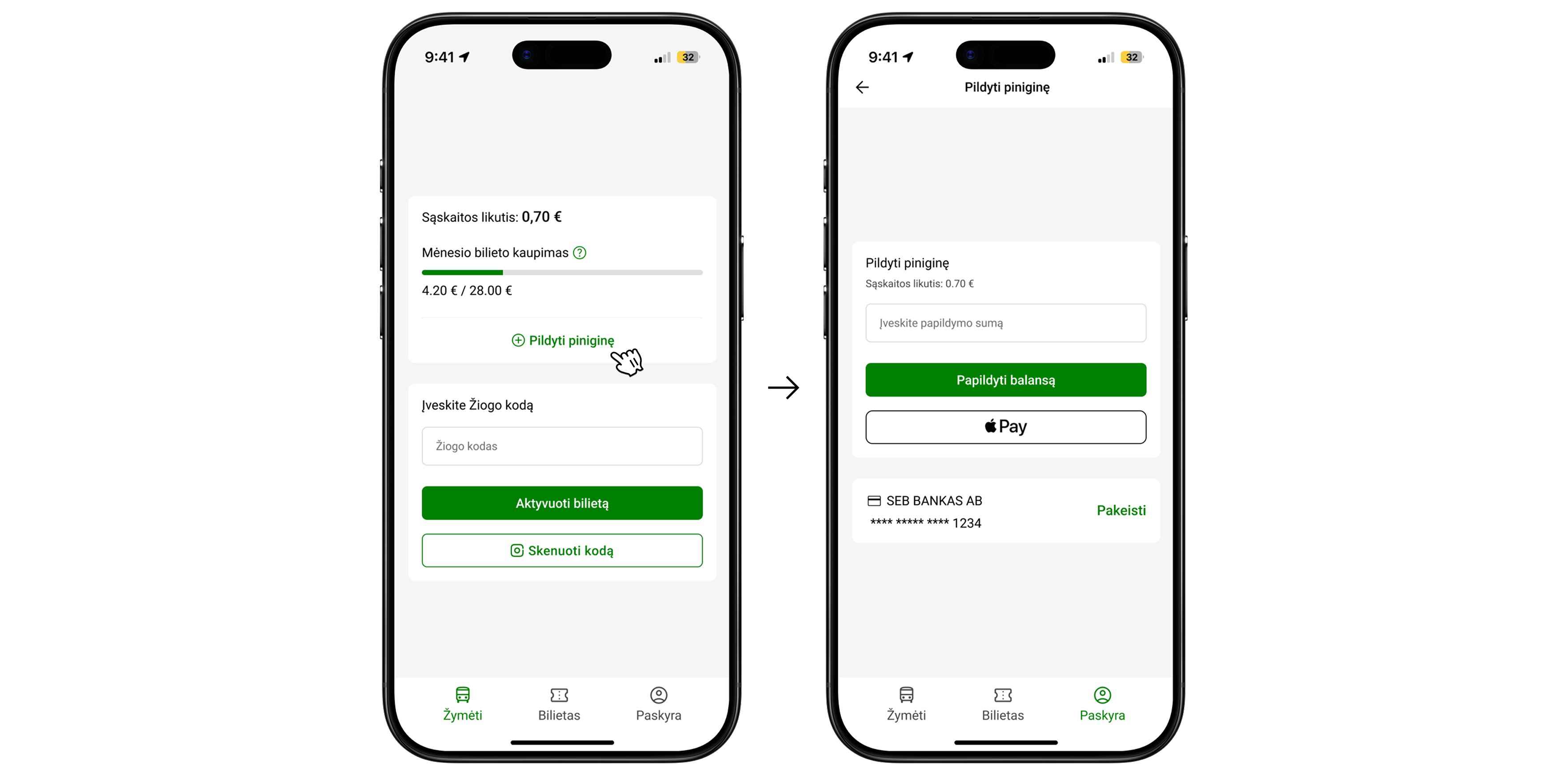
Solution: As you can see, I completely redesigned the interface to make it cleaner and more consistent. I created a wallet card where users can easily see their balance and monthly ticket progress. I added a clear “Papildyti piniginę” button for topping up the wallet, which takes users directly to the top-up screen where they can add funds. I also updated the design of this screen to match the new visual style of the app.
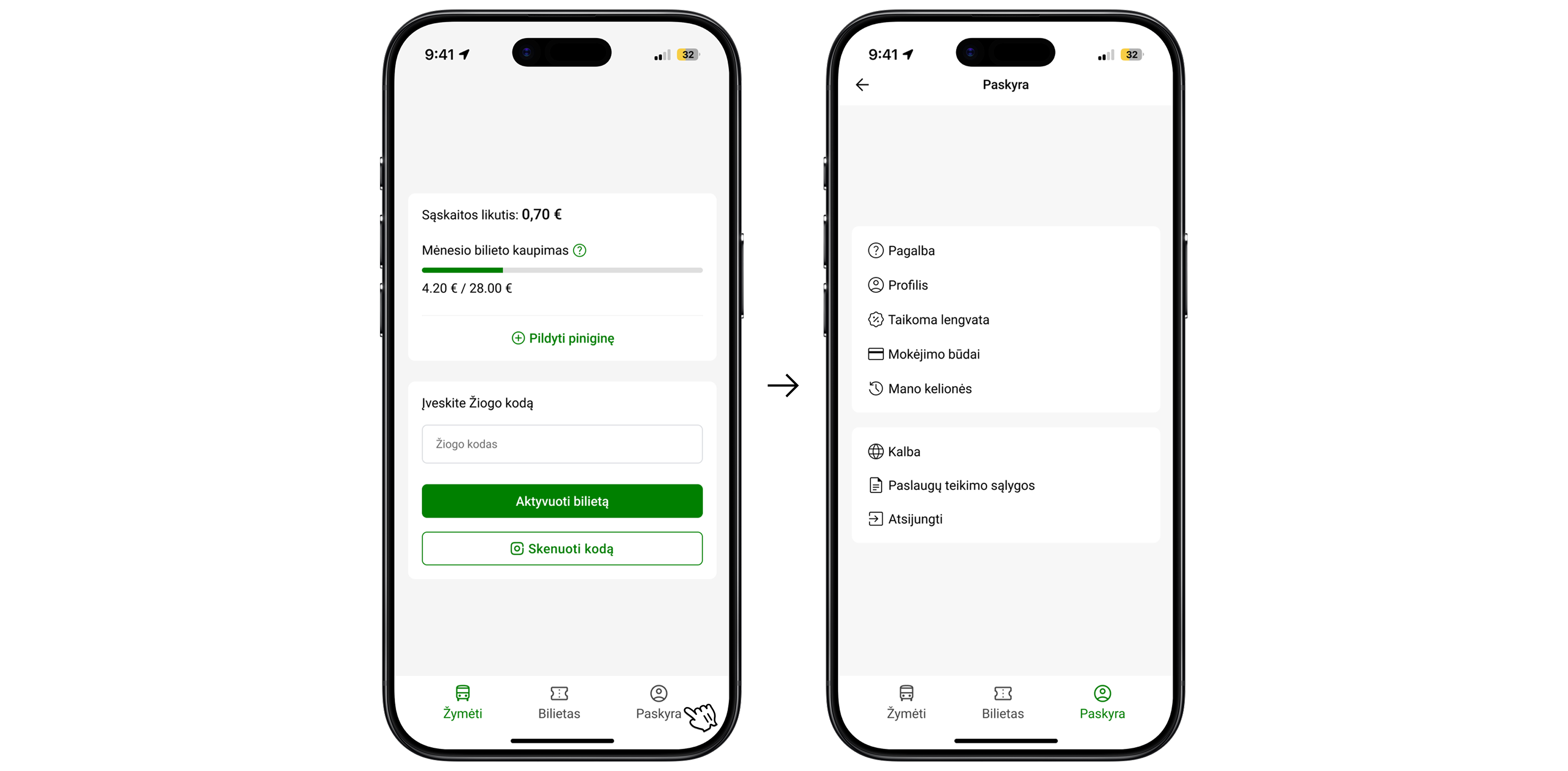
The second thing I noticed is that the “Žymėti bilietą” button is one of the most important actions in the whole app, but visually it looks just like other, less important buttons like “Istorija” or “Nustatymai”.
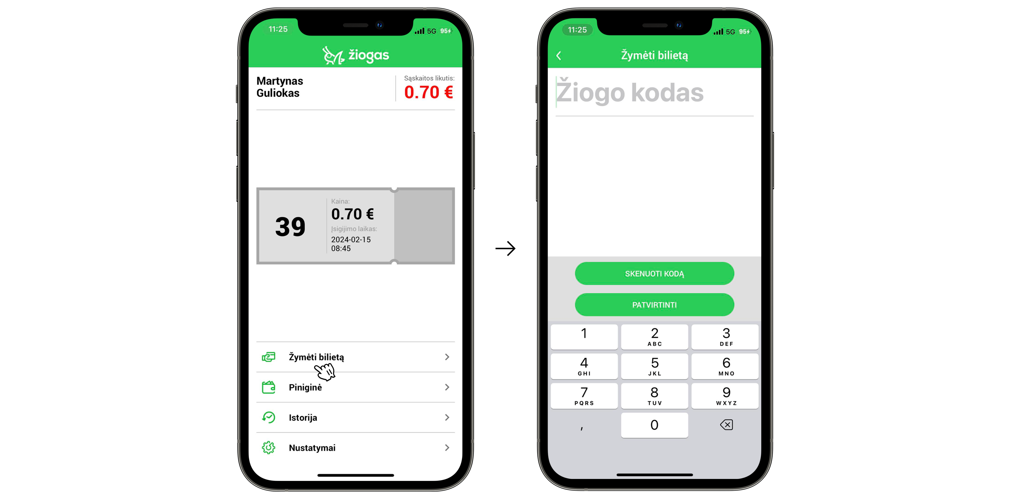
Solution: I created a clear and visually distinctive section for entering the ticket code and activating a ticket. The buttons “Aktyvuoti bilietą” and “Skenuoti kodą” are now more prominent, immediately drawing the user’s attention to the main action - marking a ticket. Users can now enter the code and activate their ticket directly on this screen.
Whoa, timeout! Even pixels need a coffee break. Still here? Great, let’s fix two more things
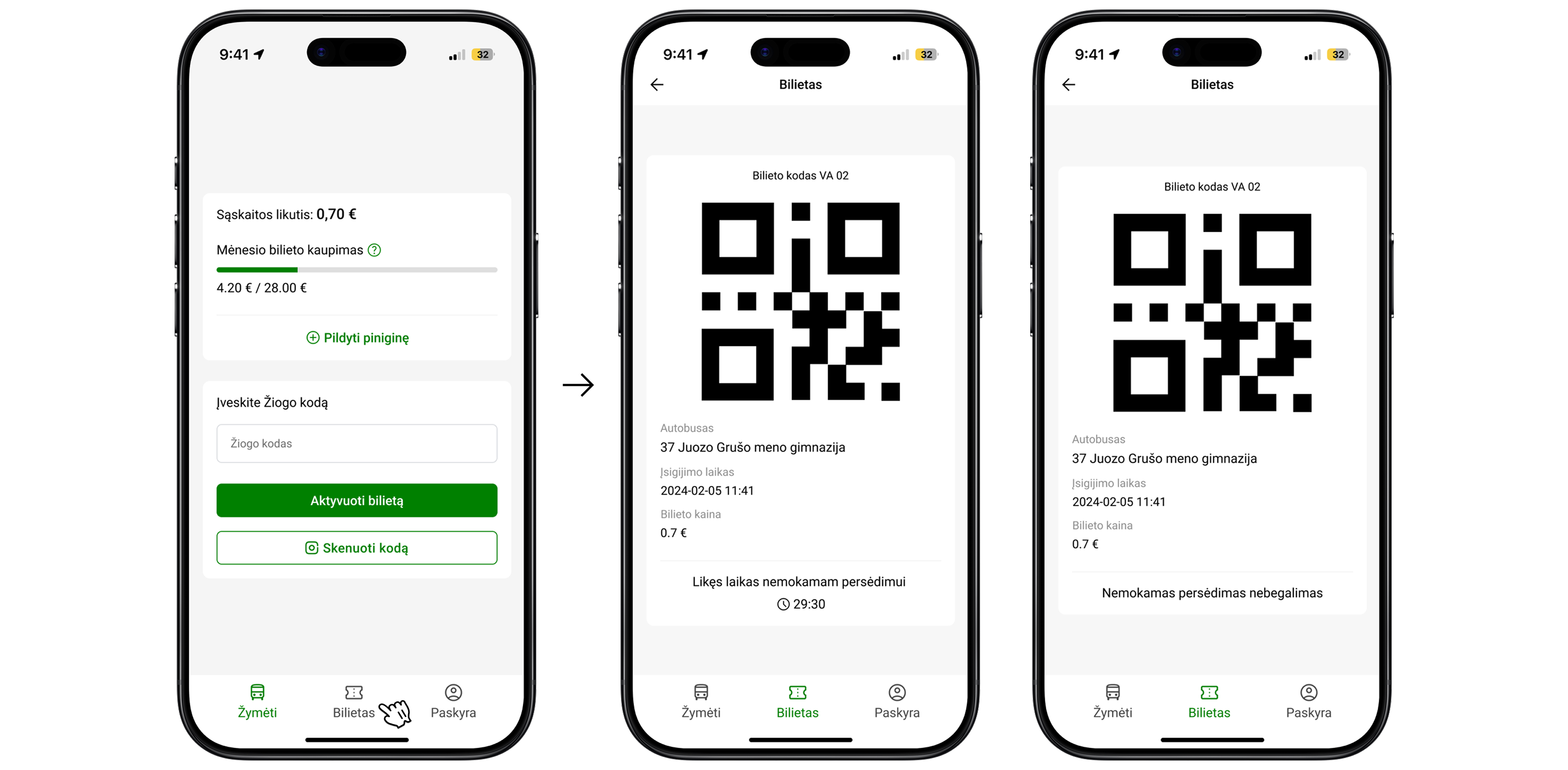
The third thing I noticed is that the ticket information on the ticket itself is unclear. There are no visual cues indicating that the ticket is clickable or that it reveals more details when opened. It’s also confusing what the large number “10” and the countdowns mean. When a user taps the ticket, it expands, but to present it to a ticket inspector, they need to tap another button “Pateikti kontrolei” which opens the same ticket again, only this time with a QR code.
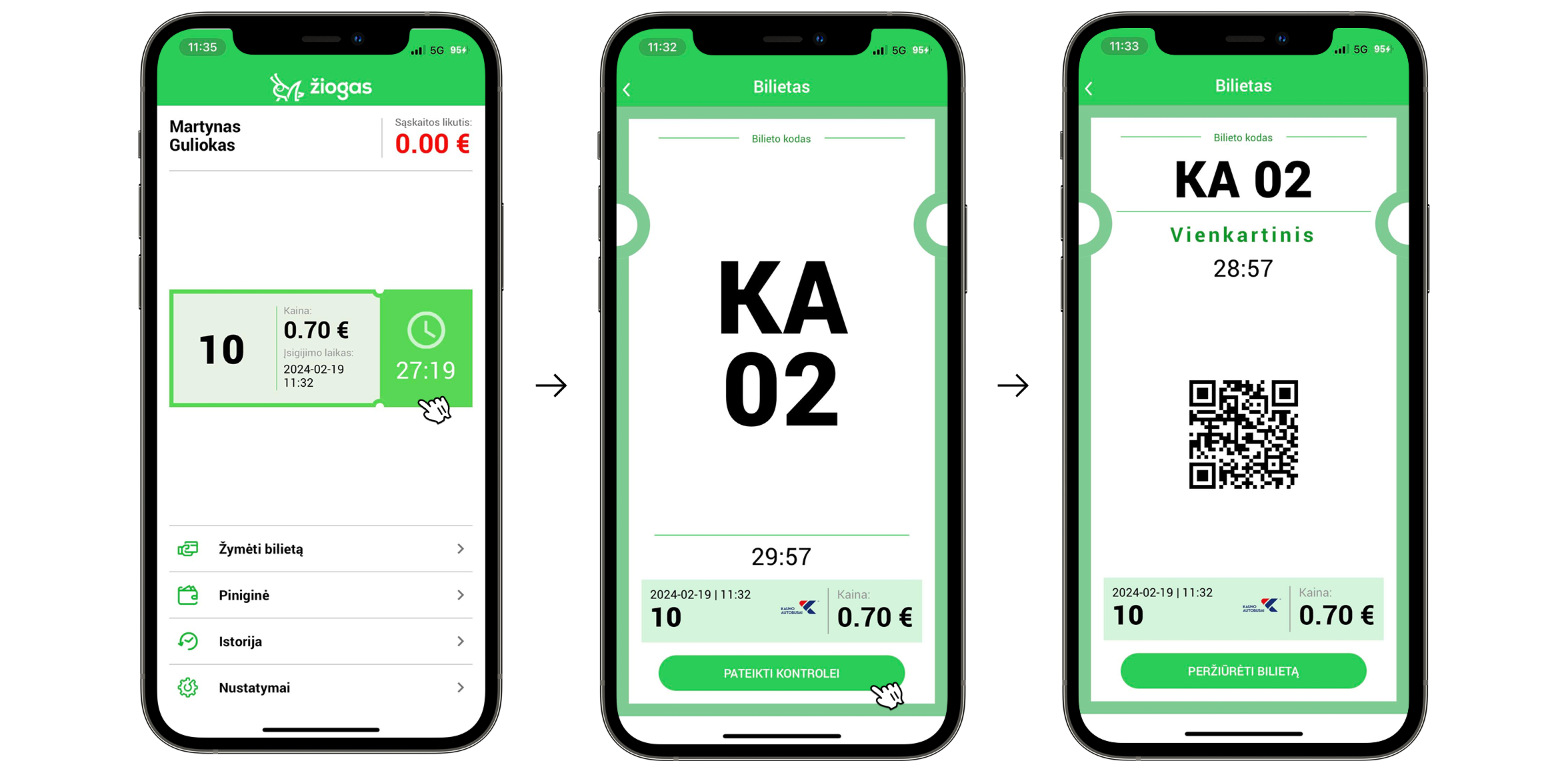
Solution: I added a new “Bilietas” tab to the bottom navigation bar for easier access. When users tap the “Bilietas”, the ticket opens directly, displaying all relevant information with clear labels and explanations. A large QR code is now immediately visible on the ticket screen, allowing inspectors to scan it right away. At the bottom of the ticket, a countdown shows how much time is left for a free transfer. Once the countdown ends, the text automatically updates to indicate that free transfers are no longer available.
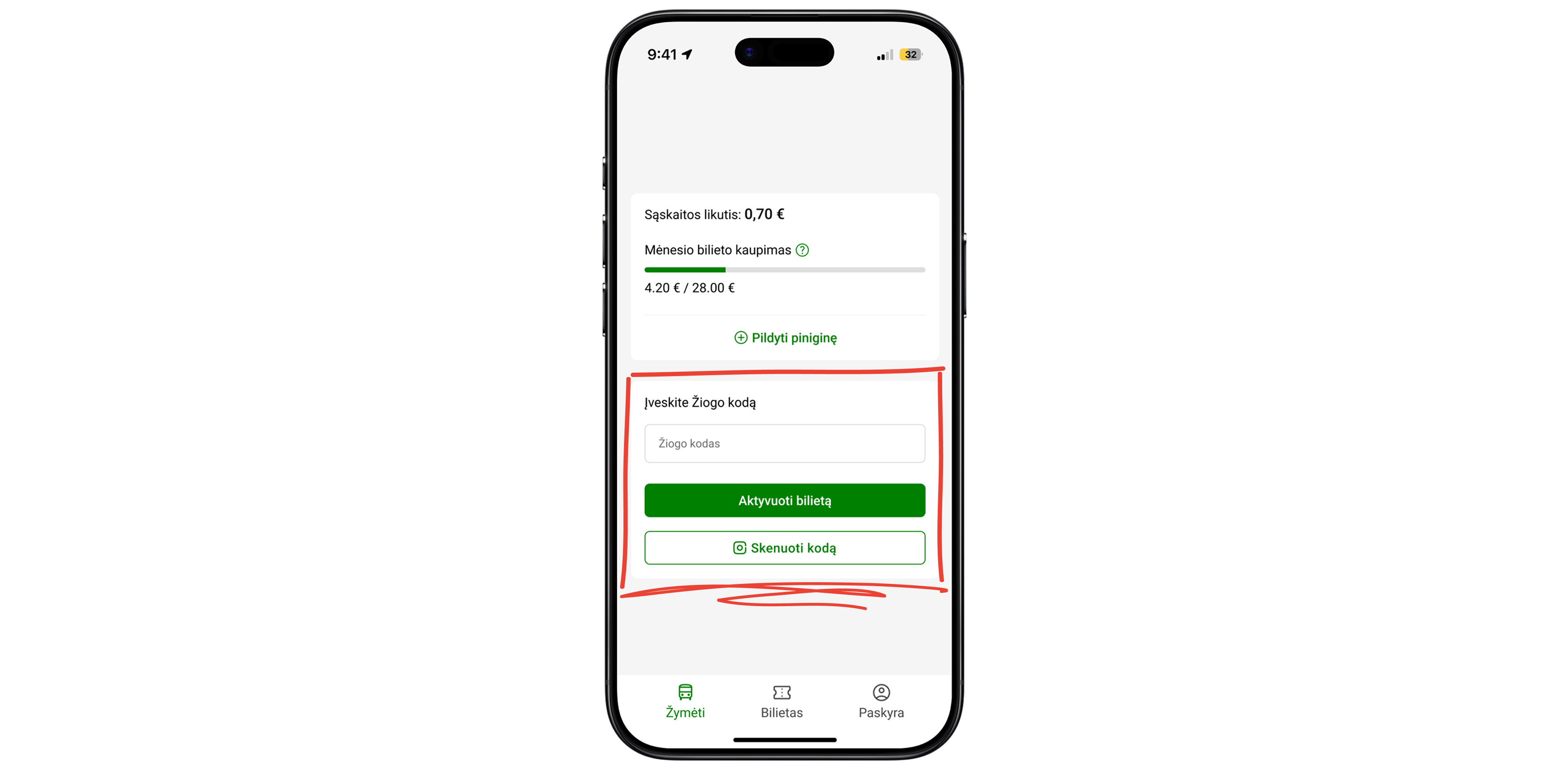
The fourth thing I noticed is that, as I mentioned before, the buttons “Žymėti bilietą,” “Piniginė,” “Istorija,” and “Nustatymai” all look the same, without any emphasis or visual hierarchy to highlight the most important actions. This layout also takes up too much space, as shown in my previous redesign proposals, this area could be used much more efficiently.
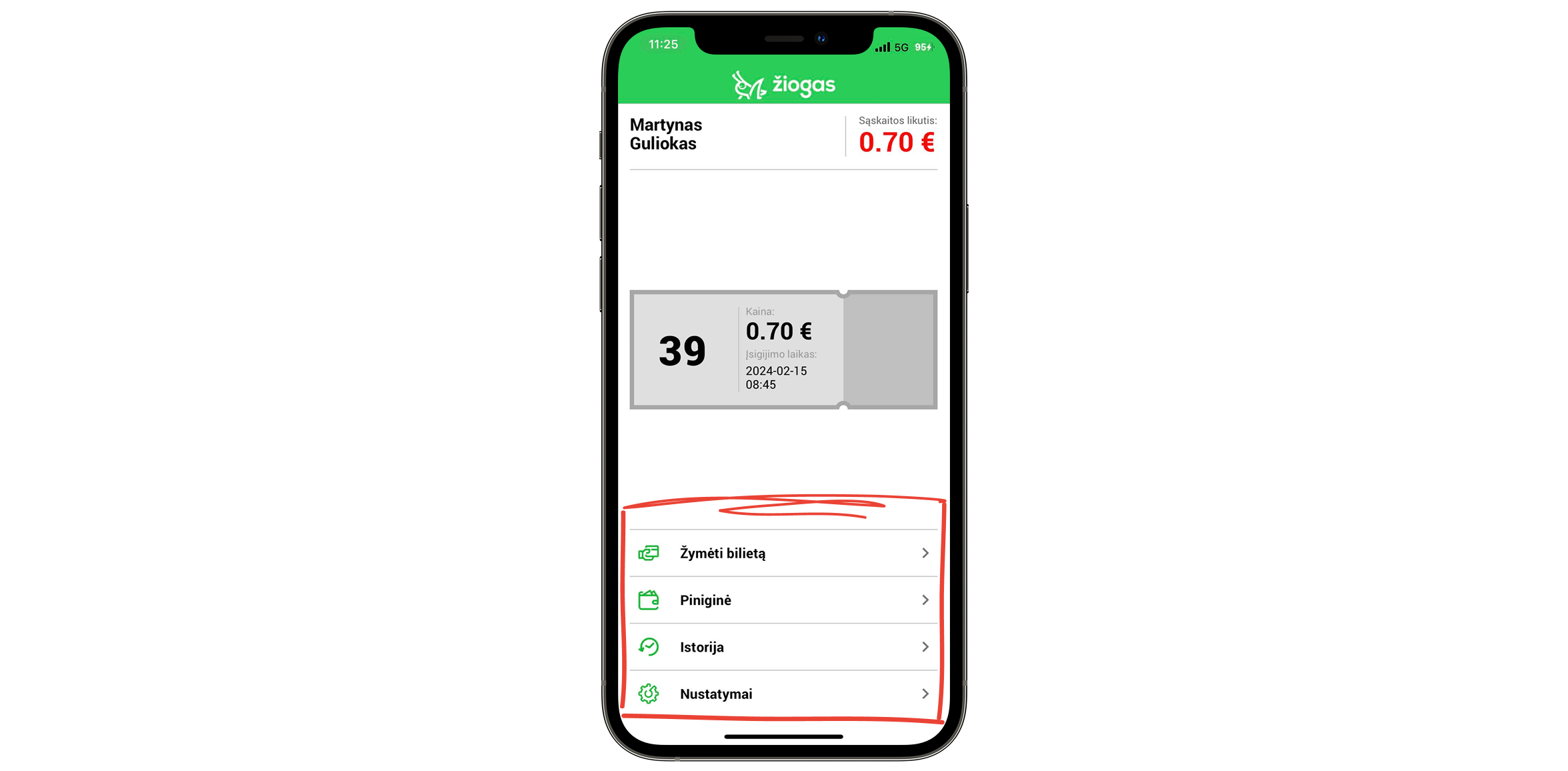
Solution: As described in the second solution, I created a ticket activation section for “Žymėti bilietą.” For the other buttons, I designed a new bottom navigation bar with clear, separate tabs for each section. I also added an “Account” tab that combines all secondary features such as History, Settings, Help, and others, so everything is organized in one place.
Current design
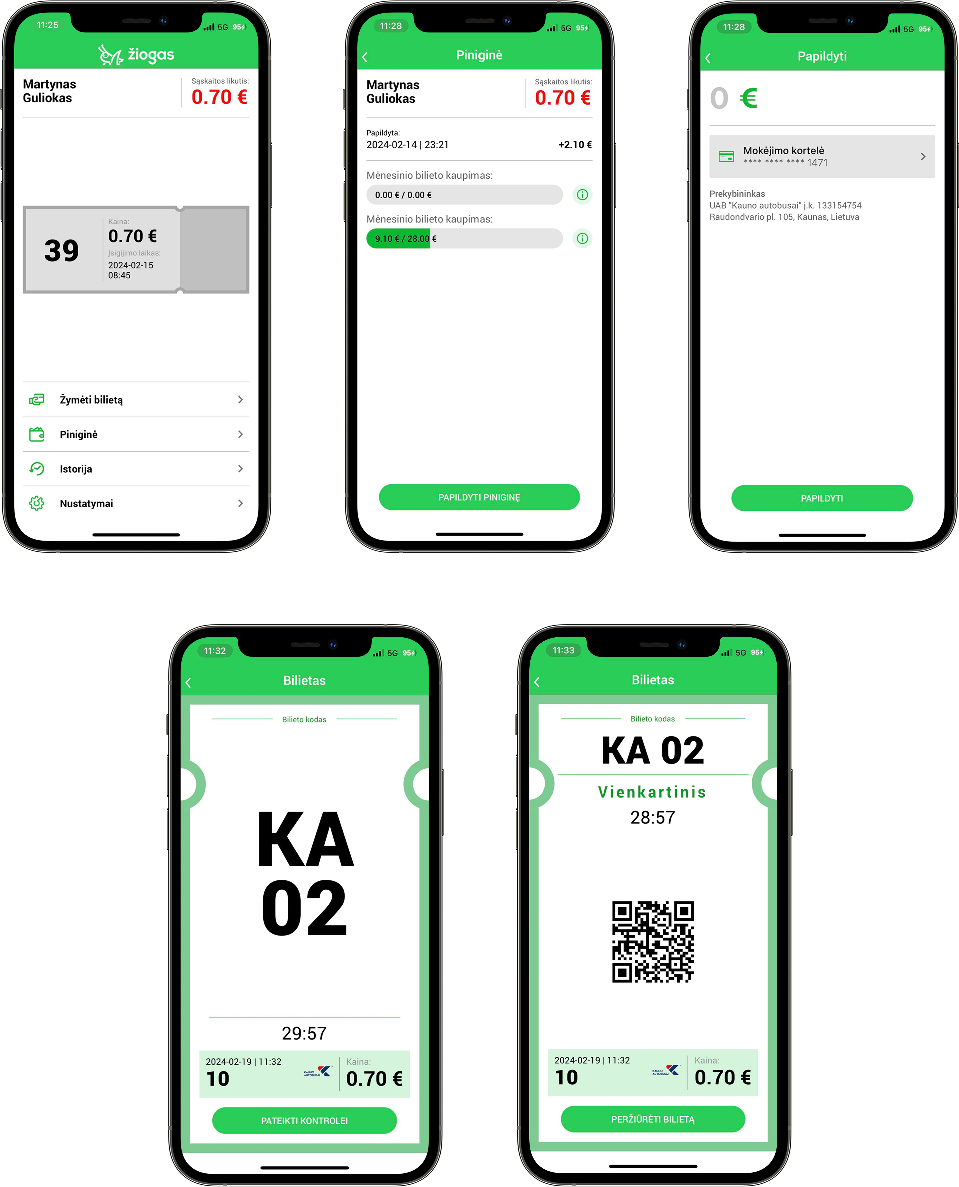
Redesign
Martynas Guliokas
Reach out

Žiogas app redesign: Identifying usability issues and designing improvements
Personal project for learning and portfolio
While exploring the Žiogas public transport app, I noticed that the experience felt a bit confusing - especially for people new to the system.
I saw an opportunity to create a smoother, faster flow that makes it easy for anyone to buy a ticket without overthinking. This redesign focuses on reducing friction and making public transport feel effortless and intuitive.
I’ve noticed 4 things that could be improved.
- The first thing I noticed is that there are two ways to top up your wallet, and both could be improved.
- The first option - tapping the red balance amount - is unclear because there’s no visual indicator or affordance suggesting it’s clickable. Even as a frequent user, I didn’t realize it was interactive until someone told me.
- The second option involves an unnecessary extra step: going to the “Piniginė” section, then clicking “Papildyti piniginę” before being able to add funds.
Solution: As you can see, I completely redesigned the interface to make it cleaner and more consistent. I created a wallet card where users can easily see their balance and monthly ticket progress. I added a clear “Papildyti piniginę” button for topping up the wallet, which takes users directly to the top-up screen where they can add funds. I also updated the design of this screen to match the new visual style of the app.
- The second thing I noticed is that the “Žymėti bilietą” button is one of the most important actions in the whole app, but visually it looks just like other, less important buttons like “Istorija” or “Nustatymai”.
Solution: I created a clear and visually distinctive section for entering the ticket code and activating a ticket. The buttons “Aktyvuoti bilietą” and “Skenuoti kodą” are now more prominent, immediately drawing the user’s attention to the main action - marking a ticket. Users can now enter the code and activate their ticket directly on this screen.
Whoa, timeout! Even pixels need a coffee break. Still here? Great, let’s fix two more things
- The third thing I noticed is that the ticket information on the ticket itself is unclear. There are no visual cues indicating that the ticket is clickable or that it reveals more details when opened. It’s also confusing what the large number “10” and the countdowns mean. When a user taps the ticket, it expands, but to present it to a ticket inspector, they need to tap another button “Pateikti kontrolei” which opens the same ticket again, only this time with a QR code.
Solution: I added a new “Bilietas” tab to the bottom navigation bar for easier access. When users tap the “Bilietas”, the ticket opens directly, displaying all relevant information with clear labels and explanations. A large QR code is now immediately visible on the ticket screen, allowing inspectors to scan it right away. At the bottom of the ticket, a countdown shows how much time is left for a free transfer. Once the countdown ends, the text automatically updates to indicate that free transfers are no longer available.
- The fourth thing I noticed is that, as I mentioned before, the buttons “Žymėti bilietą,” “Piniginė,” “Istorija,” and “Nustatymai” all look the same, without any emphasis or visual hierarchy to highlight the most important actions. This layout also takes up too much space, as shown in my previous redesign proposals, this area could be used much more efficiently.
Solution: As described in the second solution, I created a ticket activation section for “Žymėti bilietą.” For the other buttons, I designed a new bottom navigation bar with clear, separate tabs for each section. I also added an “Account” tab that combines all secondary features such as History, Settings, Help, and others, so everything is organized in one place.
Current design
Redesign
Martynas Guliokas
Reach out

Žiogas app redesign: Identifying usability issues and designing improvements
Personal project for learning and portfolio
While exploring the Žiogas public transport app, I noticed that the experience felt a bit confusing - especially for people new to the system.
I saw an opportunity to create a smoother, faster flow that makes it easy for anyone to buy a ticket without overthinking. This redesign focuses on reducing friction and making public transport feel effortless and intuitive.
I’ve noticed 4 things that could be improved.
- The first thing I noticed is that there are two options to top up your wallet, both inefficient.
- The first option tapping the red balance amount, is unclear because there’s no visual indicator or affordance suggesting it’s clickable. Even as a frequent user, I didn’t realize it was interactive until someone told me.
- The second option involves an unnecessary extra step: going to the “Piniginė” section, then clicking “Papildyti piniginę” before being able to add funds.
Solution: As you can see, I completely redesigned the interface to make it cleaner and more consistent. I created a wallet card where users can easily see their balance and monthly ticket progress. I added a clear “Papildyti piniginę” button for topping up the wallet, which takes users directly to the top-up screen where they can add funds. I also updated the design of this screen to match the new visual style of the app.
- The second thing I noticed is that the “Žymėti bilietą” button is one of the most important actions in the whole app, but visually it looks just like other, less important buttons like “Istorija” or “Nustatymai”.
Solution: I created a clear and visually distinctive section for entering the ticket code and activating a ticket. The buttons “Aktyvuoti bilietą” and “Skenuoti kodą” are now more prominent, immediately drawing the user’s attention to the main action - marking a ticket. Users can now enter the code and activate their ticket directly on this screen.
Whoa, timeout! Even pixels need a coffee break. Still here? Great, let’s fix two more things
- The third thing I noticed is that the ticket information on the ticket itself is unclear. There are no visual cues indicating that the ticket is clickable or that it reveals more details when opened. It’s also confusing what the large number “10” and the countdowns mean. When a user taps the ticket, it expands, but to present it to a ticket inspector, they need to tap another button “Pateikti kontrolei” which opens the same ticket again, only this time with a QR code.
Solution: I added a new “Bilietas” tab to the bottom navigation bar for easier access. When users tap the “Bilietas”, the ticket opens directly, displaying all relevant information with clear labels and explanations. A large QR code is now immediately visible on the ticket screen, allowing inspectors to scan it right away. At the bottom of the ticket, a countdown shows how much time is left for a free transfer. Once the countdown ends, the text automatically updates to indicate that free transfers are no longer available.
- The fourth thing I noticed is that, as I mentioned before, the buttons “Žymėti bilietą,” “Piniginė,” “Istorija,” and “Nustatymai” all look the same, without any emphasis or visual hierarchy to highlight the most important actions. This layout also takes up too much space, as shown in my previous redesign proposals, this area could be used much more efficiently.
Solution: As described in the second solution, I created a ticket activation section for “Žymėti bilietą.” For the other buttons, I designed a new bottom navigation bar with clear, separate tabs for each section. I also added an “Account” tab that combines all secondary features such as History, Settings, Help, and others, so everything is organized in one place.
Current design
Redesign
Martynas Guliokas
Reach out